


By Marti Hearst
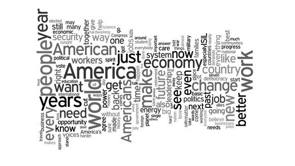
The field of information visualization still hasn’t found a lay-person friendly way to visualize the contents of text. Important speeches, conference paper titles, or letters in a historical archive most frequently wind up in a word cloud. For instance, USA Today showed this summary of President Obama’s final State of the Union Address:
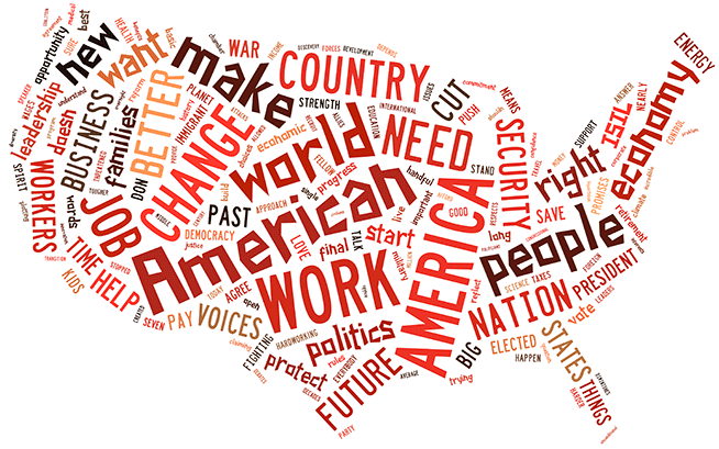
Word clouds are eye-catching, engaging, and easy to produce using online tools. They showcase which words are the biggest, and therefore the most frequent. And you can format them in even more engaging ways:
Thanks to online tools, word clouds are easy to make, and they are engaging, and that is likely a big reason why they are widely used (see this paper by Viegas, Wattenberg, and Feinberg, and Chapter 3 of Beautiful Visualization by Feinberg). No harm done when people are having fun. But word clouds are often used for serious applications, such as data science work or communication of scientific data. And journalists love them for state of the union speeches. The problem is that word clouds are poor ways to show relative values and to summarize information.
Some Problems with Word Clouds
Consider the summary of the speech written on the USA Today website just above the word cloud:
Obama defended the progress made over the last seven years and set out an agenda that will likely remain unfinished long after his presidency ends: turning back the effects of climate change, launching a “moonshot” to cure cancer, and a grassroots movement to demand changes in the political system.
Take a look at the word clouds above, and ask yourself how much of this summary is visible in them at a first glance. What about a second glance?
Since Obama only mentioned the word cancer twice, its frequency is far from the top 150 words, and it has no hope of appearing in the word cloud. He also talks about Ebola, malaria, and HIV/AIDS, as well as science and research, which are all used to express his goals for medical research.
But these words individually are not frequent enough to turn up in a word cloud, despite the fact that they group together within a single concept. This is one of the problems of using raw word counts as summaries; they are biased towards making you notice words for which there are few alternatives. As this example shows, you can’t see the medical research words in the word clouds. You may have also noticed by now that you can’t spot the references to climate change either, although they are there in the speech: oil, fuel, solar, gas, wind, energy, planet, etc.
In fact, the speech covered a wide range of topics, including veterans returning from Afghanistan, the Iran-nuclear deal, fighting Ebola, and so on, each with its own sub-vocabulary. Obama’s discussion of jobs and the economy is the only topic that clearly stands out from the visualizations. The other prominent words, such as the variations on America, new, nation, and people, are the fabric from which the speech is woven.
We won’t dwell here on why word clouds are inaccurate (see these references), but suffice it to say that if you try to guestimate how often each word occurs, you’ll likely be pretty far off. Furthermore, most people do not know that the size of the word is supposed to correspond to its frequency (see our prior work), and users of word cloud tools regularly manipulate the size to make the visualization look better. And finally, some word clouds get downright goofy. Something that looked pretty similar to this one turned up in our email one day:
Designing a Better Word Cloud
So what design would be better? I’m partial to selecting a subset of important words and comparing the use of those words within or across speeches; Barbara Maseda has a nice collection of this kind of design.
But word clouds have an appeal that is hard to deny. We set out to see if we could build a better word cloud: retaining their visual appeal, but making them more comprehensible. Our thinking is if we select words more carefully and organize them by concept, that would lead to better understanding of the underlying topics of a document. We aren’t the first to suggest this. Jeff Clark, a master of text visualization, has a version of this idea for books, and the TopicPanorama project of Wang et al. has a word cloud composed of words drawn from up to four topics.
We tested the effectiveness of this idea through a sequence of careful studies. We showed that word clouds can be more understandable with just two major changes to how they are built today. First:
Semantically
Organize
The words drawn from the document(s) must be grouped in a meaningful way into a few categories that make sense to the reader. The problem with this step is that most unsupervised algorithms for finding topics in text are unable to produce understandable, distinct categories. We’re looking at you, hierarchical clustering, LDA, LSA, etc. None of these automated algorithms generally succeed at subdividing the words in a document into semantically distinct and coherent groups. So for now, this subdivision needs to be done manually. Second:
Visually
Subdivide
A big problem with standard word clouds is that the words are all jumbled; the words for business and for economy are far apart in the visualizations shown above. Words that are shown close to one another imply that they are related in meaning, that is, about the same topic or in the same category. There are several ways we can visually suggest closeness in a word cloud; we can do any or all of these:
-
Place words from the same category in a group near one another
-
Separate groups of words from one another with open space
-
Assign the same color to words in the same category
These strategies make use of basic principles from perceptual psychology. We call the application of this approach WordZones. Let’s try it with the Obama State of the Union speech. Compare it to the first two word clouds to see if you think it is easier to interpret.
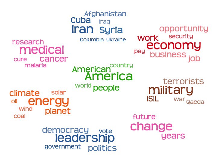
Here we selected a subset of the words from the speech, based on a combination of which were most frequent and which grouped into categories. We could have shown more topics, but the design would have gotten pretty large. This is just one layout option we found had strong user preference scores; many others are possible.
A Controlled Study of Word Cloud Layouts
Read on if you want to know more about how we showed, in a paper recently published in IEEE TVCG, that this kind of design is a better way to go than standard word clouds.
Our key findings were:
-
Visually grouped layouts are more effective in time-constrained category understanding tasks, compared to ungrouped layouts.
-
Visual grouping can be done by separating categories via whitespace or by color distinction, or both together.
-
Layouts defined by white space tend to be preferred over more tightly packed, less organized looking layouts for analytic tasks.
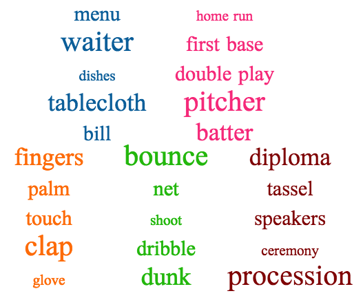
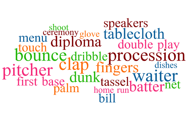
We conducted four experiments. For the first three, the task was to name all the categories in the design without reusing any of the words shown, like the game of Taboo. This is a contribution of the work itself — up to now, each piece of research on word clouds has worked with a different dataset. We designed and tested a set of 60 categories, consisting of five words each, that can be mixed and combined in different ways for future evaluations of word cloud designs. For example:
 |
 |
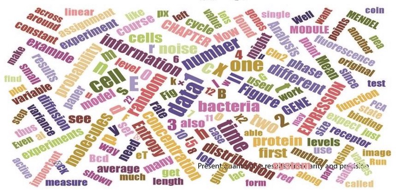
In the fourth task, we asked participants to compare four designs and tell us their preferences of the different layouts according to four criteria: readability, informativeness, visual appeal, and engagement. They were told to assume the word clouds were on a flyer advertising a class that they were considering taking, and rate the designs along both aesthetic and functionality dimensions. This was inspired by the biology course design above. Which one do you think is best?
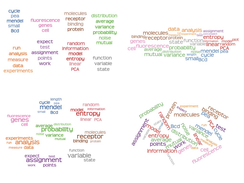
Participants gave low scores to the word cloud design across readability, informativeness, and visual appeal, with the exception of engagement, for which it was very similar to the other designs. The Column and Radial view were similar to each other across the criteria, suggesting that people might prefer them pretty much equally for many situations. The semantically organized spatial layout fell in between, which surprised us, since we thought people might prefer the spatial grouping typical of word clouds if there was no time pressure.
The Take-Home Message
If you organize the words into coherent groups, and arrange them into spatially proximal groups, people will be able to understand the underlying meaning of the document much better than if you use a standard word cloud. The groups are more effective if distinguished by color and by leaving space between them, and these arrangements are also preferred (at least for people trying to understand the underlying concepts).
The downsides of this approach are that it (currently) requires manual analysis to create the categories, which requires time and judgement calls. Word clouds do too, but you could argue that there is a standard way to make them, without editorializing, which might be important in political contexts. But we argue that the very randomness of word clouds, and the arbitrary cut offs of the counts, and the misleadingness of the relative size of the words, does not make them neutral by any means.
We hope that the next time you need to visualize a document, you will reconsider choosing a word cloud. Instead, try a more sophisticated algorithm and visualization, or if you have to use a word cloud, at least organize text into zones of meaning via spatial or color grouping, so everyone can get the gist, while they have something aesthetic to look at. :)
The article was originally published on Medium. Reprinted by permission.
Authors
Marti Hearst is a professor at UC Berkeley
Steven Franconeri, Paul Laskowski, Elsie Lee, Lekha Patil, and Emily Pedersen are co-authors on the research paper that this post describes.
