

 Saxenian")


Gini-Lab: An Interactive Dashboard on Monetary Policy’s Impact on Income Inequality
Gini-Lab Dashboard
The Challenge: Monetary Policy & Inequality
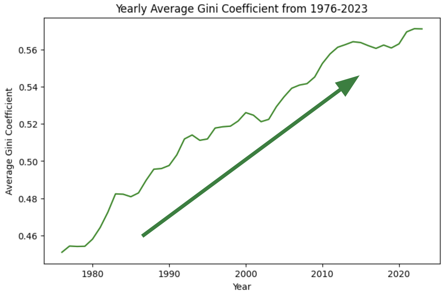
Rising Inequality. Since 1976, the U.S. Gini coefficient has steadily climbed, reflecting growing income inequality. As noted by Nobel Laureate Joseph Stiglitz, monetary policy—especially after the 2008 financial crisis—has disproportionately favored the wealthy. Today, the top 10% hold 70% of national assets.
Barriers to Action:
Lack of Real-Time Tools: No interactive systems simulate policy effects on inequality.
Infrequent Reporting: The Fed publishes updates periodically, not continuously.
Non-Reproducible Analysis: Custom consulting lacks scalability.
Academic Silos: Valuable insights remain buried in research papers.
Misallocated Resources: Billions are spent without focus on inequality impact.
Our Solution: The Monetary Policy Dashboard
We built an interactive dashboard that quantifies and visualizes how interest rate and monetary policy shifts affect income inequality in real time.
Core Functions:
Simulate how rate changes affect Gini inequality.
Visualize historical vs. projected inequality trends.
Estimate current inequality using ML-driven metrics.
Impact:
Supports equitable, data-driven policy design.
Makes inequality trends accessible and transparent.
How It Works: Models and Methods
Time Series Forecasting (ARIMAX)
Forecasts future Gini values using exogenous variables like the Fed Funds Rate (DFF) and M2 money supply.
Real-Time Estimation (LSTM)
A Long Short-Term Memory model uses economic indicators (e.g., credit and asset levels) to predict current Gini values with high accuracy.
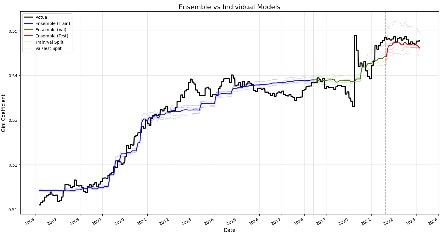
Random Forest (Exploratory)
Ensemble model used for comparison. Strong performance, but less robust with time dependencies.
Causal Analysis (DiD)
A Difference-in-Differences approach isolates monetary policy's impact by comparing U.S. inequality trends with Canada as a control.
Data Pipeline & Preprocessing
Pipeline Steps:
Collection: Economic and financial data from FRED, Yahoo Finance, and inequality databases.
Integration: Time-aligned datasets create a unified time series for modeling.
Storage: Data is saved in cloud-accessible formats (e.g., CSV in Google Drive).
Variable Types:
Leading indicators: e.g., interest rates — forward-looking levers.
Lagging indicators: e.g., inflation — reflect realized economic outcomes.
Preprocessing Highlights:
Merged datasets by date.
Resampled to standard frequencies (monthly/daily).
Imputed missing values.
Chronologically split data to preserve forecasting structure.
Gini Calculation & Model Evaluation
Gini Coefficient Estimation
We computed the Gini coefficient using quarterly data from Blanchet et al. (2022), which splits income shares by socioeconomic group: bottom 50%, middle 40%, and top 10%. A weighted approach accounts for population size in each group. Though not the most granular, this method offers a strong relative estimate of inequality over time.
Machine Learning Model Comparison
Model | Test MAE | Test MSE | Test RMSE | Selected for the final product? |
|---|---|---|---|---|
ARIMA (Baseline) | 0.003738 | 0.001602 | 0.040029 | No |
ARIMAX | 0.000485 | 0.000001 | 0.000563 | Yes, forecasting gini |
Linear Regression (Baseline) | 0.011027 | 0.000130 | 0.005605 | No |
LSTM | 0.001133 | 0.000002 | 0.001385 | Yes, current gini |
XGBoost | 0.003849 | 0.000032 | 0.005696 | No |
RandomForestRegressor | 0.0001587 | 0.00000057 | 0.0007531 | No |
We tested SARIMAX, LSTM, XGBoost, and RandomForest to estimate and forecast the Gini coefficient using macroeconomic indicators.
ARIMAX (Selected for forecasting): Integrated exogenous variables like log-transformed DFF and M2, improving over baseline ARIMA. It accurately captured trends despite underestimating COVID-related volatility.
LSTM (Selected for current estimates): Significantly outperformed linear regression. It captured temporal and nonlinear relationships with key features such as mortgage-backed securities, balance sheets, and student loans.
RandomForestRegressor (Exploratory): Used lagged inputs for one-step-ahead forecasts. While strong in prediction accuracy, it lacked the sequential modeling strengths of ARIMAX and LSTM.
Time Series Modeling – ARIMAX
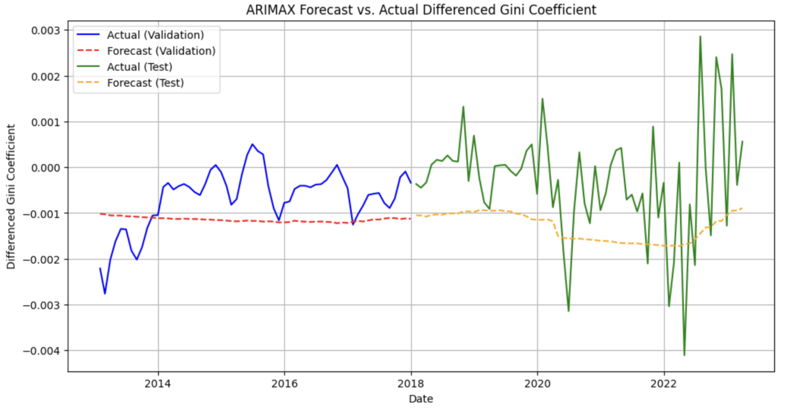
After validating ARIMA(1,1,1), we extended it to ARIMAX by including log DFF and log M2. This model improved both MAE and RMSE scores across training, validation, and test splits. Despite challenges during the COVID-19 period, ARIMAX aligned well with actual Gini trends, offering valuable explanatory insight into policy effects.
Deep Learning – LSTM
The LSTM model, trained on FRED indicators, captured cumulative effects and time lags better than traditional methods. After tuning, the final model featured stacked LSTM layers with dropout and L2 regularization. It achieved a 12x accuracy gain over linear regression (MAE: 0.0011 vs. 0.0110), highlighting its suitability for near real-time inequality tracking.
Tree-Based Model – Random Forest
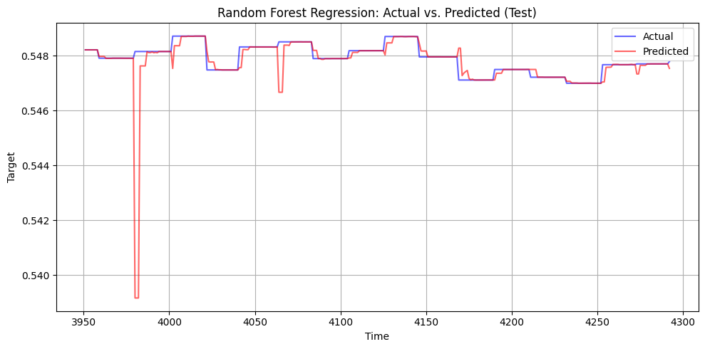
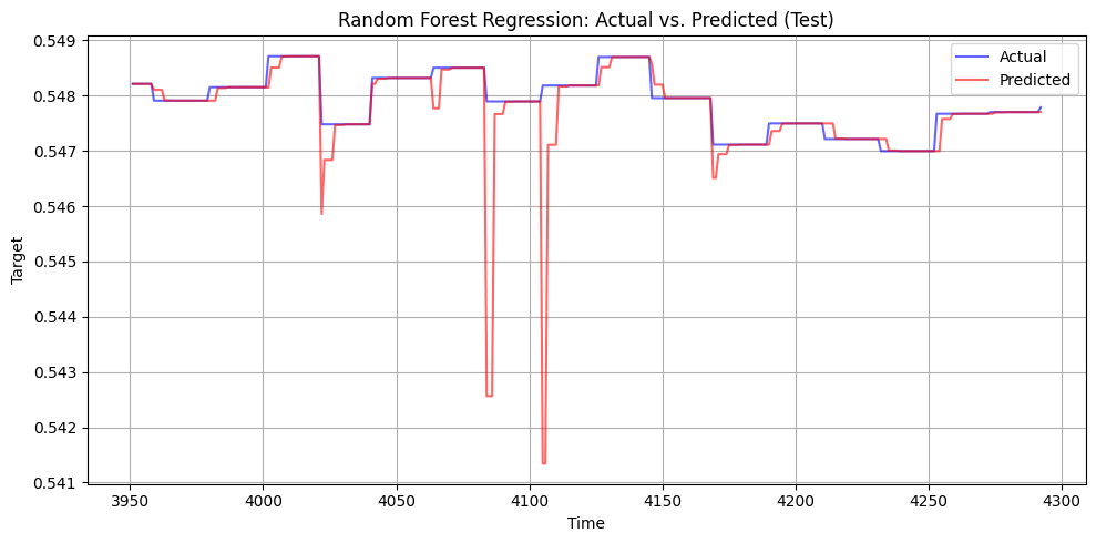
To test robustness, we transformed time series into lagged variables and trained a RandomForest with 1000 trees. While flexible and accurate (<0.008 Gini error), its episodic retraining cadence and lack of temporal modeling made it less suitable for long-term insights compared to ARIMAX and LSTM.
Causal Inference: Policy Impact via Difference-in-Differences (DiD)
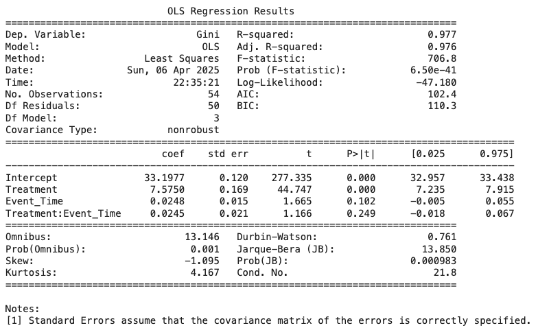
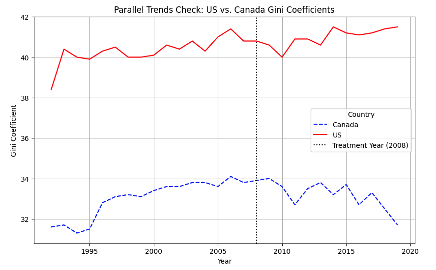
To assess how U.S. monetary policy affects income inequality, we employed a series of Difference-in-Differences (DiD) models using Canada as a control. This approach compares shifts in the Gini coefficient in the U.S. before and after major policy events against corresponding trends in Canada—a similar economy unaffected by U.S. policy.
Initial models used only basic controls (e.g., time trends), while later models added macroeconomic variables like interest rate spreads and inflation-adjusted money supply (M2). As model complexity increased, the DiD interaction term became statistically stronger, indicating that monetary policy shifts in the U.S. contributed to rising inequality.
We validated the parallel trends assumption through a dynamic event study. Although pre-1992 Canadian Gini data was unavailable, trends post-1995 showed the U.S. and Canada moved in parallel prior to major policy interventions like the 2008 crisis. This strengthens Canada’s role as a valid control.
Across models, the DiD interaction remained positive and significant—even when controlling for U.S. and Canadian interest rates and inflation-adjusted M2. The best-performing model incorporated cross-country rate comparisons and adjusted M2 measures, confirming that policy shifts, rather than coincidental trends, drove U.S. inequality changes.
Forecasting Inequality with ARIMAX
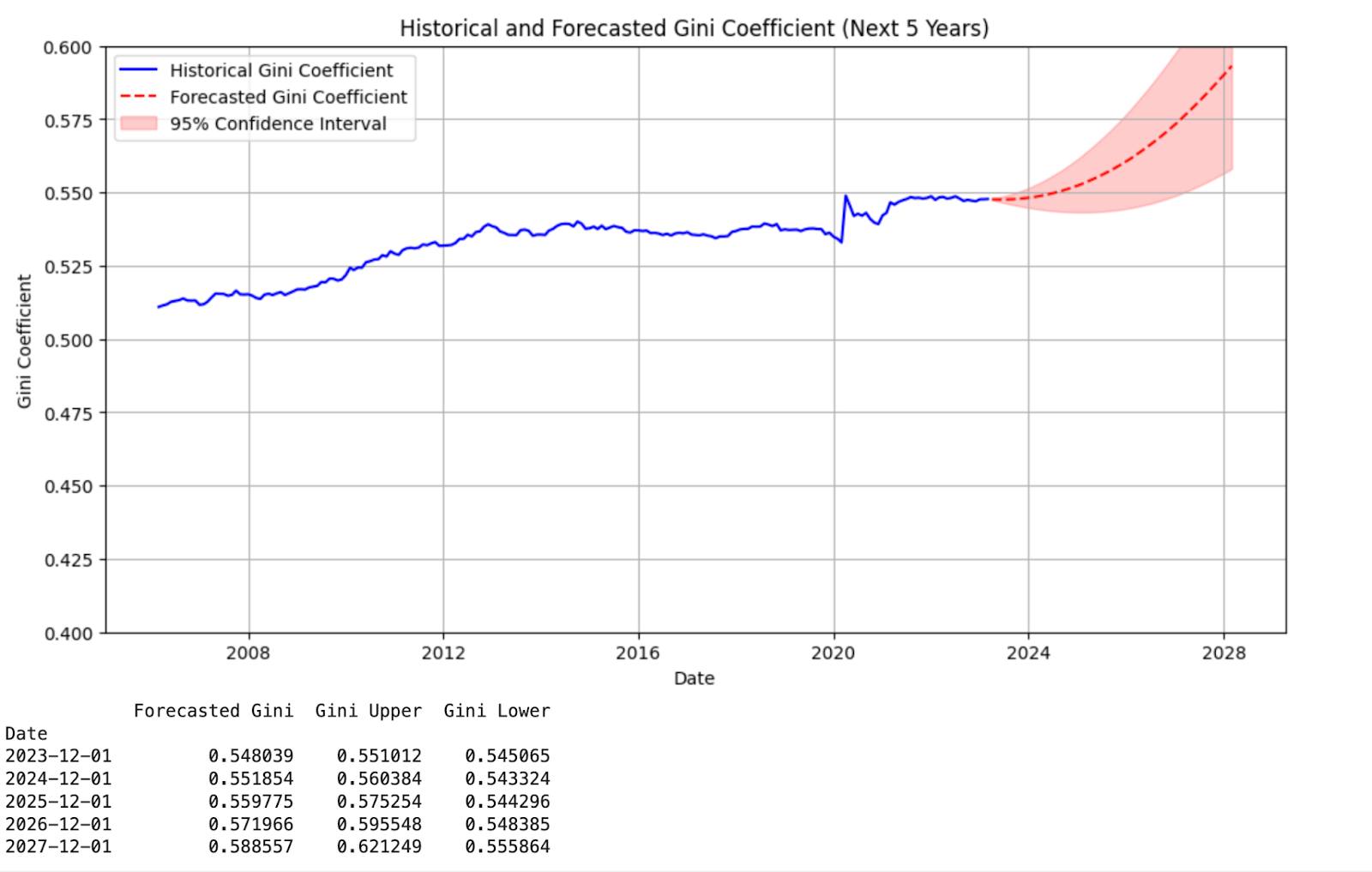
To project future inequality, we used our ARIMAX model to forecast the Gini coefficient based on monetary policy assumptions. The model takes first-differenced Gini values and incorporates external drivers like the Federal Funds Rate (DFF) and U.S. M2 supply.
Users can input custom projections—e.g., reducing interest rates by 1% per year or increasing M2 by 10%—to simulate policy impact over a five-year horizon. The model outputs a forecast with 95% confidence intervals, visualized in the dashboard.
To avoid overfitting from volatile events like COVID-19, we applied a weighting adjustment that down-weights outlier periods, allowing the model to focus on structural economic patterns.
This scenario-based simulation tool allows policymakers and researchers to evaluate potential distributional impacts of future monetary decisions—offering insight, not prescriptions.
Limitations and Model Maintenance
Forecasting Constraints
The dashboard's ARIMAX forecasts depend on historical trends and simplified assumptions about future policy variables (like DFF and M2). This makes it vulnerable to unexpected shocks or policy regime shifts. Because the model aggregates national-level data, it may also overlook regional or demographic disparities. Additional issues include non-normal residuals and the assumption of long-term stationarity, both of which can affect forecast accuracy. Forecasts should therefore be viewed as illustrative, not definitive.
Retraining Strategy
Stable periods: Retrain annually (especially for LSTM, which has a ~1.7-year forecast horizon).
Volatile periods: Retrain quarterly when macroeconomic relationships shift quickly (e.g., during COVID-19).
Trigger-based retraining: Initiate early retraining if the Fed funds rate changes by >50 basis points or if M2 growth exceeds 1% monthly for three consecutive months.
Conclusion: Insights & Path Forward
This capstone shows that monetary policy influences not just inflation and employment but also income inequality. By incorporating the Fed Funds Rate and M2 into ARIMAX models, we achieved more accurate inequality forecasts, though the models struggled with extreme volatility during crises.
For real-time Gini estimates, the LSTM model performed exceptionally well, capturing non-linear, time-dependent relationships between financial variables and inequality. Its superiority over linear methods highlights the promise of deep learning for macroeconomic tracking.
Causal analysis using Difference-in-Differences (DiD) revealed a consistent treatment effect: U.S. monetary shifts led to greater inequality compared to Canada. Yet, traditional levers like DFF and M2 weren’t individually significant predictors, suggesting other structural forces may be involved.
Together, these findings affirm that combining statistical and machine learning methods yields deeper insight into complex policy dynamics. Still, challenges remain—especially around volatility sensitivity, causal inference limitations, and the need for frequent model updates.
Future Enhancements:
Apply ensemble models (e.g., Random Forest) to improve robustness.
Introduce shock-sensitive models to better handle structural breaks.
Explore alternate causal designs like Regression Discontinuity to refine impact analysis.
Course
Data Science 210. Capstone , Spring 2025